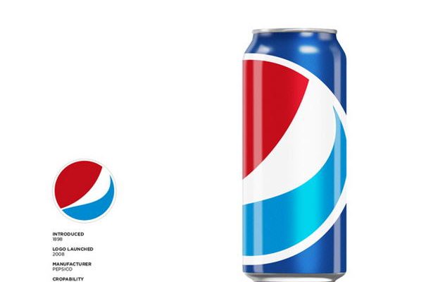
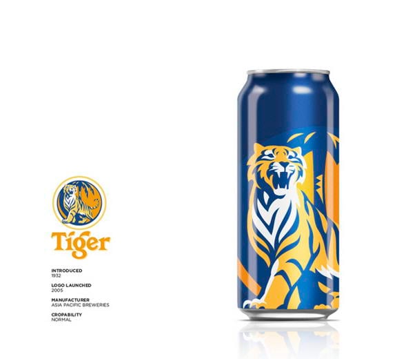
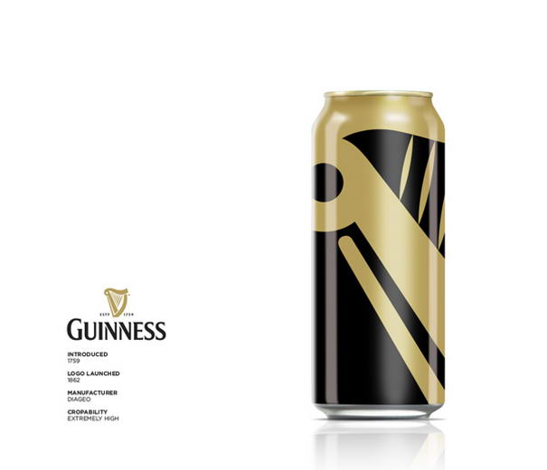
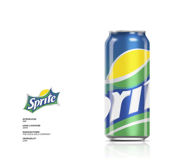
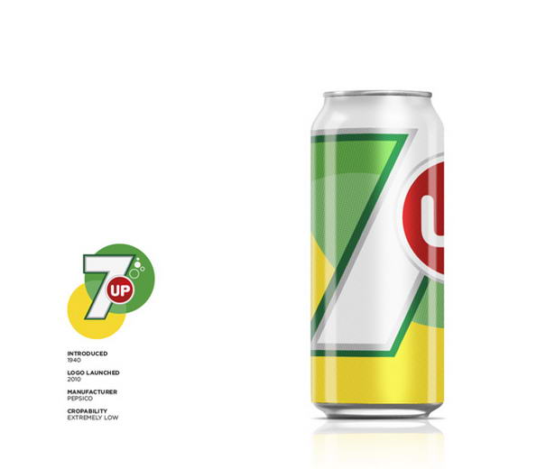
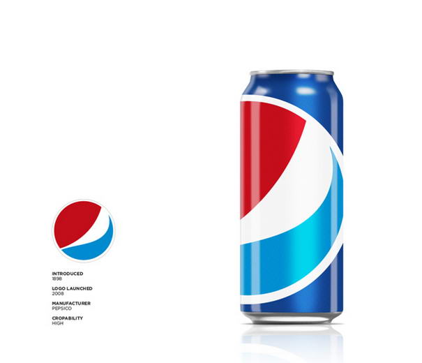
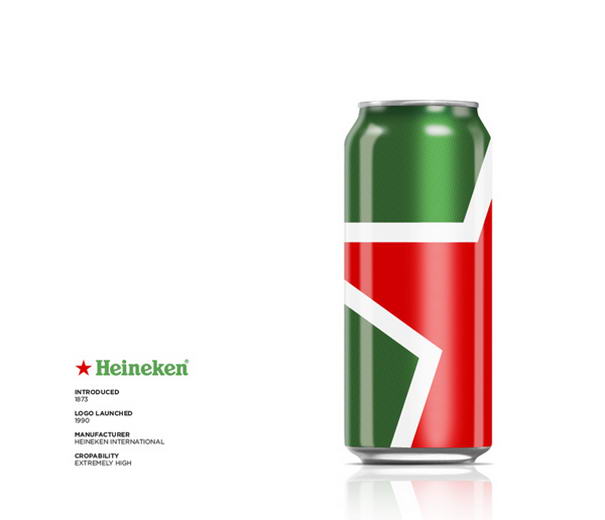
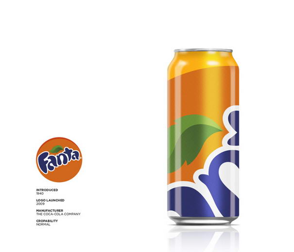
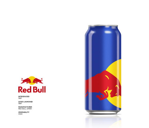
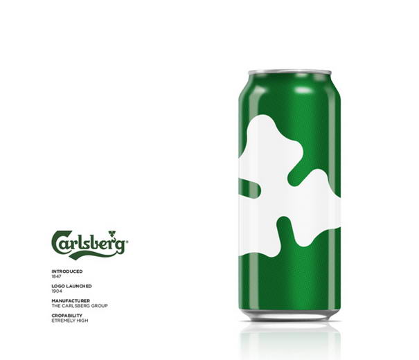
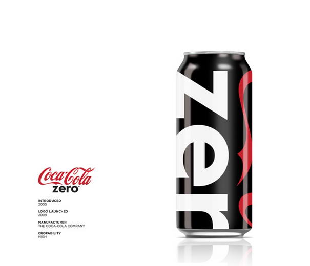
This stylish project, brought to us by design artist Ewan Yap, explores how “less is more” within famous drinking brands. Ewan created a series of experimental packaging redesign based on the principle of ‘Big Brand Theory‘. The main focus is to have each brand’s identity meticulously and uniquely cropped out of the packaging as much as possible, yet maintaining it’s integrity and comprehension and, at the same time, enhancing the aesthetic value. As you can see from the results below, he is really good at this purpose.
Check out 10 Most Effective Package Redesigns By Ewan Yap.
10 – Tiger
09 – Guinness
08 – Sprite
07 – Seven Up
06 – Pepsi
05 – Heineken
04 – Fanta
03 – Red Bull
02 – Carlsberg
01 – Coca Cola Zero
Via: BIG BRAND THEORY


