A Business card is generally a standard 2×3 inch card that displays contact information for an individual employed by a company. It is one of the most effective ways of letting your potential customers know about you without seeing you. You don’t need to use your marketing skills in speaking with them to show them what you offer and what services you can. Maybe those customers might not need you for now but tomorrow they could. Generally all types of businesses use business cards for it is a great help in extending one’s market. Nowadays, even individuals use cards to give away their contact information. It has gone a long way already and is becoming more in demand especially with the variety of designs that graphic artists have creatively conceptualized. But there are things you need to consider in designing business cards in order for it to serve its purpose.
Check out 10 Most Efficient Tips For Designing An Effective Business Card. You can use online printing services to have your business cards the next day after reading tips from that list.
10 – Know your Purpose
Before designing your card, try to identify your goal. You may want to introduce yourself and your business. Or may be you want to tell the difference from your business market. If you are able to determine your purposes, it will be easier for you to know what to include on you business card.
09 – Don’t Forget to Include all Important Information
Make sure that your name, your cell phone number, fax number, office telephone number, email address, your office address, your company name and your company logo is there. Also you can include your linkedin profile, even your bbm number.
08 – State Your Business
Just company name is not enough. Tell your customers what you do and what services you offer. Describe your business well. You don’t need to make it too long anyways. Even a short sentence is enough.
07 – Make it Elegant
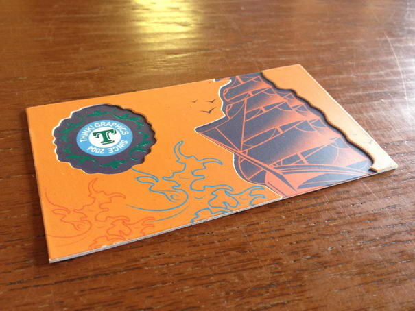
Make the look worth remembering. People would love to see unique and elegant business cards There are lots of designs for business cards and it is up to you to make it catchy and interesting.
06 – Use a Photo Or Picture

Showing them a clean card with just your name and contact number is something like giving them a piece of paper with your handwriting. So, better include a photo or Picture. It can be your photo or a different Picture that depicts your business type.
05 – Check out Other’s Business Cards
Before final printing, don’t forget to check out other’s business cards. Collect all the business cards you can find, even if you don’t need them. Together, they will act as an “inspiration file” that will provide you with valuable tips that you can use to design your business cards.
04 – Reflect Your Image
Make sure that your business card reflects your image. If you are an artist or a graphic designer, it is OK to use trendy colors and fonts. If you are an investment banker, a sober layout and colors such as blue or gray work better.
03 – Use A Quality Paper
Unless you plan on cutting the paper yourself , you will want to buy the type of paper that comes already perforated. It would be perfect if your paper is water resistant!
02 – Pick The Most Suitable Size
Limit the size of your business card to 3.5″ x 2″. Anything bigger won’t fit in standard card holders and your card may end up in the trash.
01 – Make it Easy To Read
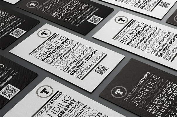
Use high contrast between the background and the type. Light background with dark type works better. After your logo, your name should be the largest piece of information on your card.
The Cardinal Components: What Should Every Business Card Possess?
In the vast realm of business networking, a business card can often be the first point of tangible contact. Given its weight in first impressions, what exactly should you include on this little rectangle? Here are three components you should never miss:
Contact Information: It might seem obvious, but ensuring your contact details are clear and easily readable is paramount. This includes your name, position, company name, phone number, and email address. For those more digitally inclined, consider adding a QR code or LinkedIn profile.
Logo and Branding: Your company’s logo or personal branding should be prominently featured. This reinforces brand recognition and fosters trust. Make sure the design complements your company’s colors and aesthetics.
Unique Selling Proposition (USP): While space is limited, incorporating a short tagline or USP can differentiate you from competitors. It succinctly communicates what you offer and why you stand out.
Incorporating these components ensures that your business card isn’t just a repository of contact details, but a small retail business brand ambassador, ready to introduce and establish your professional presence wherever it lands.


